We’ve heard your pleas. We’ve spotted your tweets. We’ve seen your hacked together solutions and mocked up versions of the UI of your dreams. And while it might have taken us longer than what would be considered “fast” or “reasonable” or “at all acceptable by human standards,” the wait is finally over. Today, we’re beginning to roll out Clubhouse dark mode in all of its moody, non-blinding-you-at-3-am glory.
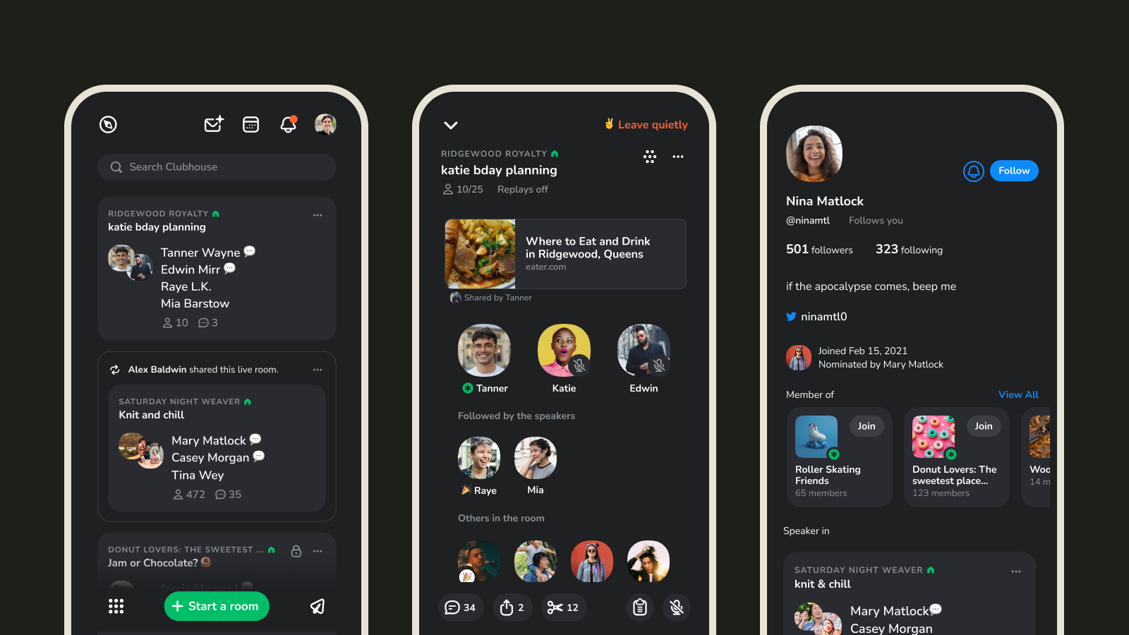
It's exactly what you'd expect — light, but not too light, text on a velvety dark background. This makes it easier for night owls to hang on Clubhouse until the wee hours of the morning (and might save your battery life a bit, too).
You can turn it on by going to settings and selecting “dark mode”. From there, you have the option of “Always Dark Mode” or “User Device Settings,” a.k.a. matching whatever your phone is doing at that moment.
Dark mode starts rolling out on iOS and Android Thursday, April 14th. Don’t panic if you don’t see it right away, it’s gonna take us a couple of days to update everybody. And as always, please send us your thoughts, feedback, and suggestions as you test this feature.

